Showing posts with label Linocut. Show all posts

Friday, 31 January 2014

Picasso Linocuts at the British Museum

The British museum recently acquired sets of proofs of two late linocuts by Picasso - "Still life under the lamp" and "Jacqueline reading". They are currently on display in room 90, where all the good stuff goes.

Jacqueline... is a two block print. Each is shown printed separately. The more complex of the two, developing tones like a crude engraving to show the modelling of the face, is shown in two states. The simpler one, showing outlines you might expect from a linocut, is shown in one state only. Finally, the two are printed together to form the finished print.

Still life... is a multi-coloured print. A proof has been taken from every stage of printing so that every decision about carving and the effect each colour had is clear and easy to trace. Again, the finished print is displayed alongside. Personally, I don't like it much but I respect it and I have learned from it.

This is a rare opportunity to see the development of important pieces by a giant of recent art. There are proper insights into Picasso's creative process waiting to be gleaned. Its an interesting show for anyone into 20th century art in general or Picasso in particular, a very interesting show for anyone who makes art and an absolute must-see for any block printers and lino cutters out there.

The show is free and runs until 6 May.

Wednesday, 4 December 2013

New Work: Cooper's Hill Coppice


Bet you thought I'd abandoned the project! It has been a long time coming, but here we have the next two instalments from the series, July and August. The reason for the delay is that I have been pushing the medium until it screams and begs for mercy which has led to a fair bit of failure. These two don't push the envelope in terms of carving but they do in terms of printing and the way I'm using paper.

The first one, July, involves four processes which range from princess-and-the-pea delicacy to barely controlled violence. The key to the process is changing the texture of the paper part of the way through printing. Finding a paper that did everything I wanted took 6 weeks and is the main reason for the delay.

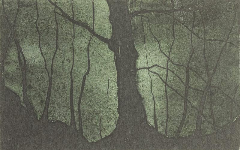
The second one goes to the other extreme. When I was picking out the paper and I asked whether I'd get away with it for block printing, the look on the man from Atlantis' face was a picture. Why? I hear you ask. Well, the thickness of paper is measured in terms of weight. For context, watercolour paper typically ranges from 160-600 grams per square metre. Typical drawing paper will range from 100-200 gsm. Photocopy paper might be 80 gsm. Tissue paper is often around 20 gsm. The paper I have used is 9 gsm. It's a Japanese hemp based tissue and if you breathe heavily it floats away. The reason I wanted it was its transparency and smoothness. In this edition I have printed the green canopy, mucking about with the inks to give a hint of texture. I have then mounted it so it floats above a dark brown backing to give the rest of the colour. Perhaps it is a little too eerie for August, but it has so much atmosphere I didn't want to change it.

Monday, 29 July 2013

Adventures in Linocut: Nicky Browne & Tessa Charles at Hampton Court

Yesterday I went to see a show by two specialist lino-cutters, Nicky Browne and Tessa Charles. It is at the Fountain Gallery just across the bridge from Hampton Court Palace and runs Tuesday to Sunday until the 4th of August.

They were having a "Meet the artists" afternoon so mostly I went to steal their knowledge but I had a good look at their work as well and interestingly the only thing the two bodies of work had in common was an interest in the craft and the process.

 Nicky's work is often quite architectural in subject and very much related to drawing; indeed there were several drawings on display as well. It emphasised line making. The ones that fascinated me most use the trick of printing white ink on a dark background. This means that when she carves she takes away where the lines will be in the finished work and effectively prints the background. This enables her to use standard drawing techniques like cross hatching and helps keep lines flowing, relaxed and of a consistent width. This uniform width is the key to her work. It is as if it has been drawn with a technical pen and the end result is that some of her work has a curious feel like a very free and loose engraving - which I suppose it is.

Tessa by contrast is all about simple blocks of colour (some flat, some textured), arranged to form complex images. Her themes and subjects were often about nature - plants, feathers and animals all made an appearance. She seems to take particular delight in using more than one colour on each block. Sometimes these are areas of two colours blending into each other, sometimes one is overlaid onto another and sometimes they are kept entirely separate. On one level this is pragmatic as it allows multi-coloured prints without worrying about registration but it also allows an extra level of creativity and interest and must require some serious skill and experience with a roller.

The contrast between the two makes the show all the more fascinating and it's well worth a look if you're in the area.

Wednesday, 17 July 2013

New Work: Quercus Quercus

By now, any regulars here will know Cooper's Hill and the woods that blanket it. You've seen photos, paintings and linocuts. There's a path that runs along the bottom edge of the woods from the Ferrari garage past Mudward to the wizened tree in the April linocut before bursting out of the end of the woods and continuing on to the Runnymede Memorial. Partway along the path, if you care to look over your left shoulder, you will see two magnificent oak trees interweaving without ever touching. This linocut is a study of their winter silhouette.


It is an edition of 30 on Japanese-style washi. The printed area is about 13.5cm wide x 16cm high. I've varied pressure to leave the branches more lightly printed and the core of the trees darker and stronger.

As I'm prone to doing, I have taken a slight liberty with the title. Strictly speaking the trees are called quercus robur, commonly known as the English, French or Pedunculate Oak. If, however, one goes another level up through the taxonomy of plants, it is in the quercus section of the quercus genus (that basically means its in the white oak group of oak trees - you learn something every week here!) so although no-one would really call it quercus quercus if you stretch a point it kind of is. I wanted to call it that though because, just as two identical words come together to form one name, so two very similar trees come together to form one silhouette - indeed in summer they look like one tree with two trunks.

This is just step one on the path to something I find very exciting based on two observations - 1: it is so difficult to work out which branch belongs to which tree I might as well choose for myself and 2: one tree appears more masculine, the other more feminine. This is the final stage of my prep work except I need to change medium, find a different printing technique or work far bigger - any time I tried to shave the branches finer the lino started to crumble.

Sunday, 2 June 2013

Adventures in Linocut: Cooper's Hill Coppice

Ta-daa! The first two linocuts. They show the woods above Runnymede. Each is an edition of 12 with one artist's proof which I will be retaining. Each is 10cm x 15 cm and printed with a raw umber oil based ink on handmade mulberry tissue. They will be for sale either mounted or framed; I will decide on final pricing when I have seen them properly presented.

The one to the left is the first I did. It shows part of the bluebell glade in May and is a good illustration of the consequences of the particular combination of printing technique and paper I have chosen. The paper is very variable in thickness, texture and opacity and has the odd small inclusion (a little leaf or petal) and they were printed with an improvised baren (that is to say I placed the paper on the lino then applied pressure manually, one section at a time) so I have been able to vary the pressure in different areas. This gave me the opportunity to react to the particular sheet of paper in relation to the design and, by fitting the paper to the lino before I started ( thicker areas of paper over the the darkest areas of the trees, thinner parts where I wanted relative softness and so on) and then varying the pressure I applied. I have managed to get some areas very harsh and others softer, some very dark and others faded to try and enhance the effect of light dappling to the ground. I felt it important to point this out because it means that there are substantial variations between each print; although they share a design each of the 12 is effectively unique.

The one to the right shows a tree on the edge of the woods in April before it had been swamped in leaves. It is far harsher, bleaker and more wind-swept, just like this April was! I have used the same techniques to play with the tones but restricted the variation to the bottom right corner and the bulkiest parts of the tree trunks.

Provide the framing is done these will make their debut at the art society's Spring show next Sunday at the Italian Concept restaurant in Egham from 10-ish am onwards.

Friday, 24 May 2013

Adventures in Linocut continued...

Here it is, a snap of my first linocut. It's one of the bluebell glades in the woods above the mead. When I've done a few more I'll be wishing it were better, but for now I'm chuffed. I've printed half the edition now and will do the rest tomorrow. Only having done the odd proof up until now I am surprised at just how physically demanding printing with a baren is - it may be easier with a proper one which is designed for applying pressure but I can't justify that expense yet so am improvising.


It's 10 x 15cm and in Raw Umber on mulberry tissue. I'm talking to a framer and if I can afford it, black walnut should set the ink off nicely. I'll take a proper photo when I've finished printing.

Thursday, 23 May 2013

Khadi Papers

With my first linocut just needing tweaking I have ordered some delicate handmade paper from Khadi.

Khadi is a small company working with paper makers in India and the surrounding countries. The Indian papers are handmade from rag in the Western tradition. They come in a huge range of sizes, up to perhaps the biggest handmade paper in the world. As each size is made on a mould of that size rather than being trimmed down they all have deckle edges, which is nice.

A lot of the non-Indian papers they source are in the Eastern tradition, with mulberry, lokta and mitsumata prominent in the range. In fact some of the papers aren't just the same species of bark the Japanese use, they are made with the same methods too. Their Himalayan range is effectively a budget priced handmade Japanese style range.

I have bought a lightweight smooth rag, one of the Himalayan Washi papers and mulberry tissue. As soon as they arrived I couldn't help myself; its proofing time! No photos yet until there are finished prints but here are first impressions.

These papers are very suited to block printing with care. There is obviously a long woodcut tradition in Japan which has evolved hand in hand with the evolution of Washi. It has enough transparency to enable you to see the progress of the print as you work it. It has a lovely absorbency and is astonishingly strong for such a thin paper. The mulberry tissue is surprisingly strong (although it becomes very delicate while saturated with wet ink) and has a beautiful, uneven transparency so will take the brightness of the board it is mounted on for framing and is very easy to see through whilst working, but it is essential to have a layer of paper between the baren and the paper to protect it. The rag is very smooth and far and away the softest Western style paper I have come across this side of blotting paper. This is because it is only lightly sized with gelatin. I would be reluctant to let watercolour anywhere near it even in heavier weights, but it looks like it would be an exquisite drawing surface. That very softness and absorbency means it picks up both the ink and the texture of the block with relatively little pressure.

They all have their place but for this set of prints I choose mulberry tissue. I need a bright white that the washi can't provide. The rag picks up detail almost too crisply for this design. The tissue can be crisp too, but less so, and its transparency means you can see progress clearly enough to manipulate the amount of ink it picks up - since this print is based on dappled sunlight this is a bonus. Tomorrow I have to work out a work area thats right for me; then its time for my first ever linocut edition...

Wednesday, 8 May 2013

Adventures in Lino

As regulars will know I am experimenting with linocuts. A few days ago I finally got round to making my first proofs and, although I will not be showing them here, they are hugely encouraging. I really like both the feel of the process and the graphic quality the work has. An unexpected benefit is that because the tools want to go in a straight line my slight tremor effectively disappears. Anyway, now that I think the first three skyline/landmark paintings are done (I won't be sure for a day or two yet) I'll take a couple of weeks off from painting to keep myself fresh and will concentrate on lino.

I have read a bit about it just lately and the fundamental skill seems to be drawing so I should be okay with a little experience. One of the things I came across is a video of an artist by the name of Bill Fick showing the entire process from surface preparation to finished proof. I thoroughly recommend watching it. As a film it has a nice rhythm in its own right and it makes the process crystal clear.

http://billfick.com/2011/02/07/anatomy-of-a-linocut/