Showing posts with label exhibitions. Show all posts

Tuesday, 7 April 2015

Coming this June: Runnymede Ghost

This summer, the world is coming to Runnymede and I'll be here to welcome everyone.

The tale of how Magna Carta was signed here has been told many times already this year, and it will be told even more over the next two months. This is because this strange treaty which has become one of the most famous and influential documents in the history of Western civilisation is about to be 800 years old.

There are huge celebrations surrounding the anniversary with events taking place worldwide. I am delighted to say that as the contemporary painter perhaps most local to the site of the signing of the treaty I am taking part and holding an exhibition to coincide with festivities in conjunction with Royal Holloway, University of London.


Both of these are essentially medieval views
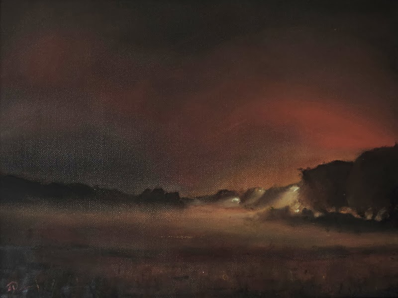
The initial brief was simple - celebrate the landscape of Magna Carta - but the work has become far richer and I will be presenting a series of paintings which show the landscape as it is today in all its complexity and variety but highlight how easy it is to imagine how it looked at different times in the past including 800 years ago. The title, Runnymede Ghosts, simply draws attention to the way one can see the past through the present. Making the work has revealed a subtle and complex story which is as much about the environment as it is about history and has revealed Runnymede as ancient, fragile, resilient and above all man-made.

The thing I want to talk about is the final painting, which really ought to be well advanced already. All the prep work was done and I was just waiting for the bluebells to come out so I could finalise my palette when my subject was hit with some unexpected drama. There has been an encampment of protestors in the woods above Runnymede for the last two or three years. They initially tried to resurrect the spirit of the Diggers and have styled themselves more recently as an eco-village. My original plan was to show one particular part of the camp where there are still signs that the top of the hill was once parkland. The old, broken fence was to wend its way and guide the eye through the painting.


Over the last week or two, the landowners have given the protestors a writ to attend court with a view to eviction and have started to repair the boundaries. I'm waiting to see how it pans out before starting the painting. It has had a dramatic impact visually and is also interesting in the context of Magna Carta. The protestors' spokesman suggests this is a Magna Carta issue - he sees the court action as an act of oppression. I want to play Devil's advocate here. Magna Carta came about in part because the King was out of control and was seizing land from the nobility whenever he felt like it so the Barons made it clear that the law could be used to hold him to account. The protestors saw some land and they didn't like the way the owner wasn't using it so they seized it. The landowner is now trying to demonstrate to them that they are not above the law. So which side of this conflict is in the King's role and which in the Barons'? It is a Magna Carta issue, but not the way the protestors claim. Magna Carta enables landowners to evict people because it reinforces the status of law. I don't know how all this will creep into the painting yet but I find it interesting - just as the paintings reveal that the difference between good and bad environmentally is complex, blurred and often counterintuitive, so the eviction shows that the same can be said of issues relating to liberties and rights.

Realistically the fence and eviction are too complex for one painting so for the Ghosts series I will almost certainly stick to my original composition but using the half-built new fence in the same way as the old one. I will try retain BBC levels of neutrality as I haven't decided where I stand yet. It does tell me I'm on the right track though - if my work wasn't changing my opinions and challenging my preconceptions then to my mind I'd just be making pictures not art.

Monday, 2 March 2015

Marlene Dumas at Tate Modern

I'm not given to hyperbole and I'm not convinced that concepts like "best" are useful or even meaningful in the utterly subjective world of art but let me say two things clearly: I cannot think of a living painter producing work which is more powerful, more intimate or more emotional than Dumas and I cannot remember an exhibition which moved me and involved me as much as her current show at Tate Modern.

Marlene Dumas: Moshekwa
The exhibition is mostly painting after painting of heads and figures (ranging from the demure to the pornographic) torn from all context, often painted on a monumental scale and always with a breathtaking economy and tenderness. Tenderness is the key to the work; the paintings draw you into their isolation and call out in a way that goes beyond eye contact. As a painter though, it is the economy that fascinates. They may be centuries apart in aesthetic, technique and intent, but the only painter who springs to mind as besting Dumas' stark and tender economy is Hans Holbein the Younger, especially in his drawings. In Dumas' work, large areas of thin paint are played against thicker colour, texture and tone while lines and edges are kept simple and this is enough to describe faces, features and moods with eloquence. There is enough confidence and integrity within her work to allow her to paint with delicacy, vulnerability and fragility - or even to break her subjects' faces - but that confidence permeates them and keeps the paintings powerful. She says she works from photographs to keep her from worrying what the sitter thinks and I believe this may genuinely be what enables her to paint this way.

Hans Holbein: Grace, the Lady Parker
Marlene Dumas: The White Disease
I can't help but feel I ought to write something of the artist's intent and the grand themes she explores but in truth I don't want to. The Tate's accompanying texts and the panels in the exhibition do so but it feels like it this missing the point. These paintings function the way the very best paintings do: by osmosis. Words just aren't necessary.

That is all that needs to be said. Dumas' website is here, her career details are here, the exhibition website is here. Get to London before May 10th and see it.

Monday, 16 February 2015

Reiner Ruthenbeck at the Serpentine

Ever slow on the uptake, I made it to the final days of Ruthenbeck last week. In truth, I went to the Serpentine to see Julio Le Parc but, having gone to the wrong Serpentine, I found myself confronted by three heaps of ash and metal instead of plastic and light shows. I'm glad, as Ruthenbeck forced me to evaluate things I haven't really plunged deeply enough into since returning to practicing as an artist.

There has been a palaver over the course of the exhibition, summed up nicely by the Independent here, about the quality of the pieces and whether they constitute art or not. I'm pleased to say that as a consequence of going by accident I was absolutely unaware of this so it didn't colour my own thought process.

The exhibition begins with three of Ruthenbeck's cones and heaps, each of a different type of ash partially burying a different metal structure - the geometric one pictured, a wire one and one built of large square section steel tubes. There is always a temptation to react with fatigue when facing artwork of this type. Sculptures have drawn attention to their material nature for many decades now and is the fact that ash can have many different qualities really enough of an insight or aesthetic experience to excite? Three things save these pieces though - they were made in the late 1960's at a time when such investigations were not ten a penny, the fact they were shown in close proximity to each other instead of in isolation gave them added power and, on their own terms, they are beautiful.

Much of the next room is taken up with the upturned furniture discussed at length in the Independent so I won't add much except to say I have a major problem - the presentation. In the photo the Independent carries, someone is walking between the chairs and being able to freely move around the objects may have hugely increased their worth. As it is viewers were kept behind a black line on the floor. There seems to be a consensus that pieces like this are either drawing attention to the material and aesthetic nature of their parts (which I would favour in the context of Ruthenbeck's other pieces here) or are inviting the viewer to supply their own narrative element. Both of these possibilities were undermined by half-heartedly restricting viewpoints - either restrict them completely or don't restrict viewers at all. The narrative/dramatic element would have been transformed and strengthened by the presence of people amid the field of fallen furniture, and the formal investigation would have been more compelling had the viewer been able to see the objects and their relationships from different directions. As it is, young me would have raved about this piece whereas older and more critical me is, well, older and more critical and would suggest there is no honest way to say this is stronger or weaker and more or less interesting than any of the thousands of equivalent pieces kicking around the art world. I am always surprised that artists have not yet become bored of making such things, unless perhaps it is an attempt to take the modernist project of testing art by reducing things to their essentials and apply it not to Painting or to Sculpture but to the process of making art; a declaration that the only things fundamental to art are looking and thinking.

The third room was filled with structures combining a sensuously deep red fabric with welded metal and, on occasion, clear plastic. Again they address themes of materiality and geometry but I can't help but feel such things are more interesting to make than they are to look at. Another difficulty was the presence of a suitcase broadcasting Fluxus music - the strength and weakness of sound based work is the way it disrupts everything around it and I believe in this case it was a hindrance more than a help.

The final room is the one with the most intriguing idea, and the one that chimes most with my own interests. It is a large square room, a former courtyard, and it is almost blacked out. Light comes from a single, dim orange bulb in the centre of the room and is intended to recreate twilight - specifically the amount of light at which one cannot tell the difference between a dog and a wolf. That is an inherently interesting boundary to inhabit, and an interesting way to define it. Sadly, the piece didn't quite live up to expectations - but then nothing could. Having the light barely strong enough that you can walk into the room safely meant that when my eyes had fully adjusted I could see far too clearly. Equally, by definition twilight cannot be tamed - it is constantly changing both brightness and colour and, as the phrase the phrase about the dog and the wolf suggests, is accompanied by things that play on senses other than vision. Without the explanation and the title it was a fascinating and rewarding room for stopping and just existing in. Without the room, the idea was intriguing and beautiful. Sadly though, each undermines the other just enough to render this a missed opportunity.

I have saved what I think the best pieces until last. They were perhaps the simplest yet among the most sophisticated. In one, a single, elongated parallelogram is bent in half along the long axis to an acute angle. It is then fastened to the corner of a room by a single screw. The satin black of the metal and the stark white of the wall along with the acute angle of the metal and the right angle of the wall and the single familiar point of reference provided by the screw head interacted optically, distorting both space and material. In the other, in the fabric and metal room, the shape was repeated. This time it was the fabric wrapped around four pins in the wall. The fabric, being nearly edge-on to the viewer appeared to be a dark and colourless line. The white wall picked up the reflected colour from the red and took on a phenomenally delicate rose tint which faded imperceptibly to nothing over a couple of inches. The strength of my reaction to them compared to everything else surprised me.

The great strength of this exhibition (and it is a strong exhibition in spite of my apparent harshness) is that it forces the viewer to actually do that most clichéd of acts - using the basic stuff-ness of appropriated objects and materials it genuinely and forcefully encourages the viewer to consider their own idea of art. For me, the parallelograms and the twilight held the key. These were the pieces that actually achieved what I think the fallen furniture was trying to do: they proudly displayed their nature and then transcended it. This realisation absolutely defines what art I respond to and why I'm a painter. In a painting, the flat surface covered in marks is also a moment of space or volume or light in exactly the same way that the white wall was a rose-coloured wall. Painting, for me, is the ultimate expression of a material transcending itself. It is where everything is contradiction and nothing is free of ambiguity. Painting is the twilight where dog and wolf are the same.

Any exhibition that can give so much insight into one's own practice has to be applauded. Reiner Ruthenbeck and all at the Serpentine, take a bow.

http://www.reiner-ruthenbeck.de

Friday, 3 January 2014

Now showing: Nocturnes at Guildford Library

Who knew that Guildford Library lets parts of the building be used as a gallery? Well I did, but I didn't find out very long ago.

Five of my nocturnes - two you've seen, one which is another you've seen with some reworked areas and two all new - are now in central Guildford until the end of the month. If you choose to buy one, part of the purchase price will go towards supporting the library.

It may not sound that prestigious and the spaces - staircases - may not be the archetypal white cube but it actually works really well as a gallery space and I'm very happy to be there - not least because the library is central, open long hours and heavily visited. The nature of the space works well with these particular paintings too. As you walk past them, you are moving up or down
as well as across. This means the paintings' relationship with the light is constantly changing as you move and this is critical because some of them depend on subtle variation in gloss and texture to help build an impression of space. The viewers' movement increases their chances of discovering this.


When you first see them, especially in the real world instead of an artist's studio or a more conventional gallery space, they really are sledgehammer paintings - sudden small bursts of dark and swathes of the strange sodium street lights that characterise this country at night. I was genuinely surprised at just how much oomph they have. Get past that shock though and they are minutely rich and subtle and this is the other key to the library being the perfect venue. Many hundreds of people will see the paintings every week and a high proportion of them will be there fortnightly, weekly, even every day. Regulars will have a chance to get to know the paintings in a way normally denied to people unless they own them. I don't rate my chances of selling there but I don't mind about that, I think for these paintings it is one of the best places I could have found.

Click here for opening hours and the address. The paintings are there until around about the end of January - I'll confirm here when I'm sure of the date.


Monday, 29 July 2013

Adventures in Linocut: Nicky Browne & Tessa Charles at Hampton Court

Yesterday I went to see a show by two specialist lino-cutters, Nicky Browne and Tessa Charles. It is at the Fountain Gallery just across the bridge from Hampton Court Palace and runs Tuesday to Sunday until the 4th of August.

They were having a "Meet the artists" afternoon so mostly I went to steal their knowledge but I had a good look at their work as well and interestingly the only thing the two bodies of work had in common was an interest in the craft and the process.

 Nicky's work is often quite architectural in subject and very much related to drawing; indeed there were several drawings on display as well. It emphasised line making. The ones that fascinated me most use the trick of printing white ink on a dark background. This means that when she carves she takes away where the lines will be in the finished work and effectively prints the background. This enables her to use standard drawing techniques like cross hatching and helps keep lines flowing, relaxed and of a consistent width. This uniform width is the key to her work. It is as if it has been drawn with a technical pen and the end result is that some of her work has a curious feel like a very free and loose engraving - which I suppose it is.

Tessa by contrast is all about simple blocks of colour (some flat, some textured), arranged to form complex images. Her themes and subjects were often about nature - plants, feathers and animals all made an appearance. She seems to take particular delight in using more than one colour on each block. Sometimes these are areas of two colours blending into each other, sometimes one is overlaid onto another and sometimes they are kept entirely separate. On one level this is pragmatic as it allows multi-coloured prints without worrying about registration but it also allows an extra level of creativity and interest and must require some serious skill and experience with a roller.

The contrast between the two makes the show all the more fascinating and it's well worth a look if you're in the area.

Thursday, 4 July 2013

Save the Dates: No Naked Walls & the Runnymede Gallery

Well, there's no backing out now for either me or the gallery!

Some of my work will be on show from 25 July to 29 August in Chertsey and some more during the first weekend of August, the 3rd and 4th, at the gallery in the National Trust Lodge at the Windsor end of Runnymede.

Since Chertsey is in effect my professional debut, the next two or three weeks are your last opportunity to buy from me at negotiable prices - thereafter my studio prices will be consistent with what I fetched at the gallery because to do otherwise would be unfair on the dealer and any collectors - so have a look at my website and if anything catches your eye contact me to find out about availability and pricing, you might be pleasantly surprised. I'm happy to ship worldwide but remember, when the show starts the prices will become more fixed!

Tuesday, 5 March 2013

Giorgio Morandi: Lines of Poetry


Despite having been to the exhibition of wonderful works on paper at the Estorick Collection, I do not want to write about Morandi.

Out of all the painters of the 20th Century, he is perhaps the one who is least about words, who's work most scorns all verbal attempts at analysis. I could break down compositions and tricks. I could describe his approach. I could celebrate his astounding focus. I could but will not.

Instead, I give in full a quote they have pasted onto the wall at the current exhibition:

"We are not a people suited to growing complacent in bourgeois existence. The richest and most content of our bourgeoisie always have, at the bottom of their nature, something more unquiet and restless than the poorest peasant of more northerly and happier lands that are less warm and less bright. That this fatal melancholy sharpens our vision of the world is an undeniable fact. Italian art, in its more skeletally beautiful aspects is a hard, clean and solid thing. From such denuded forms, cleansed of unrestrained enthusiasm and improper joy, is born that chaste, austere and lofty spirit which represents the highest merit of our great painting from the primitives to Raphael. Today, the confusion which oppresses the arts is enormous; and the poor quality of the painting that floods the continents with torrents of greasy, oily colour is difficult to define. There is an abundance of foolishness, much lack of understanding, a great deal of banality and cheap sensuality – and as for spirit, one would search for it in vain.

'Therefore, it is with sympathy and a great sense of comfort that we have followed the emergence, development and maturing of artists such as Giorgio Morandi through their slow but sure labours.
He seeks to discover and to create everything alone: patiently grinding his colours, preparing his canvases and looking at the objects that surround him, from loaves of ‘sacred bread’ – dark, and riven with cracks like the surface of an ancient rock – to the clean forms of glasses and bottles. He looks at a collection of objects set on a tabletop with the emotion that shook the heart of the traveller in ancient Greece when he gazed upon woods, valleys and mountains believed to be the realm of beautiful and surprising deities.

'He looks with the eye of one who believes, and the innermost skeleton of these things – dead for us, since immobile appears to him in its most consolatory aspect: in its eternal aspect. In such a way he engages with the great lyricism created by the most profound European art: the metaphysics of the most commonplace objects. Of those objects that habit has rendered so familiar to us that we often look at them with the eye of one who sees but does not understand. … In his ancient Bologna, Giorgio Morandi sings in this way – in an Italian way – the song of the great European craftsmen. He is poor, since the generosity of art lovers has thus far eluded him.  And in order to be able to continue with his work with purity in the evenings, in the bleak rooms of a state school he teaches youngsters the eternal laws of geometric design – the foundation of every great beauty and of every profound melancholy."
Giorgio De Chirico

Go to the show, digest it as slowly as it was made, then walk away satiated and in silence.

Sunday, 3 March 2013

Style and Expectation

On my recent trip to London I went to the Giorgio Morandi show in Highbury. I haven't written anything about it because I don't have a lot to say. It's good, it's interesting and it's worth a visit but, a couple of curiosities apart,  it didn't make me want to write. I will give a quick summary next week as there are things there which are important to me and I would encourage you to go but the thing that really struck me was when I overheard part of a conversation.

A lady in a remarkable outfit of a fine wool sweater - either cashmere or merino but certainly the brightest cerise in the world, ever - dark leggings and patent leather Doc Marten's was looking at an etching on the wall and comparing it to one of a similar subject in a book in a cabinet. Both etchings were depicting still lifes in similar arrangements. One was made in 1927 and the other in 1956. I was so struck by what she said to her companion that I wrote it down verbatim.

"This one is quite early. That ones later, its much better, its much more stylized"

Her point was that the later work was more in the recognisable Morandi style, with his distinctive treatment of space, ovals and tonality. This was equated with quality. There was a simple thought that the piece that was more typical must be better, because it looked more like it should look. The mannerism was more important than the individual composition. Of all the artists you could subject to this indignity, Morandi is perhaps the least appropriate. His work is about thought and careful observation, not following a formula. For me, this is the source of his rigour and integrity. If his work has certain common threads running through it, it is because it honestly and simply reflects his personality, his interests and his view of the world. This is, however, an interesting insight into the view of someone else. It may be the view of someone more typical than myself. For her, a Morandi picture should look one way and one way only. Does the same applies to other artists too? Is the criteria for judging Picasso's work how closely it resembles Les Demoiselles d'Avignon? This sits in contrast to what I believe is the artist's duty to grow and stretch himself and experiment, but if a lot of other people are more aligned with this lady than with me, it may be a key to commercial success.

There's no conclusion to this post, its just a thought I'm uncomfortable with but need to consider.

Sunday, 24 February 2013

Ice Age Art: Arrival of the Modern Mind


The British Museum's current blockbuster is a gathering of artefacts made around the turn of the last Ice Age. It argues that the existence of these 40-10,000 year old objects proves that by then man had evolved into what he is now, with the same instincts and capacity for thought. It goes on to argue that the discovery of specialised workshops and work done by experimental archeologists suggest specialist artists existed, and that means there must have been organised social groups - one hunts, another makes - and given that there are individual caves where there are similar paintings made thousands of years apart then these social groups must have retained very consistent values over an enormous length of time.


One thing I was delighted to see was the acknowledgement of, or maybe even obsession with, the fact that we will never know what the purpose of the objects was and although its fun to guess its ultimately futile. As such the secondary message was that we can't do other than appreciate these as we would contemporary art. To this end the exhibition tried to show how art had been influenced by the discovery of these objects but I found this a half-hearted distraction - a photograph of Picasso's studio, a stone Henry Moore, a couple of Matisse prints.

So what of the objects themselves? They range from the very famous - the Venus of Espugue that obsessed Picasso, a reproduction of the lion-man (the original is in a lab in Germany as some of the missing bits have recently been discovered and are being re-attached) - to things that were completely new to me. I will concentrate on just a few.

The lion-man is an underwhelming object in photographs, but in the (false) flesh it comes to life. Carved from a mammoth tusk, it is a man with a lion's head. It is simple, relaxed and stylised yet utterly sure of itself. What really struck me was its size. It is the perfect size to be grasped around the waist by a man's hand. Indeed this is really evident in the video that shows someone making a reproduction with Ice Age tools. When you consider its feet are cut at an angle so that it would not be able to stand on its own you can't help but wonder. It could have been made to lean against a wall or in a niche but with its back leaning forwards as it follows the curve of the tusk it would look like it were cowering - hardly lion-like. So surely it was made to be held. Even today, held above your head there would be a kind of "By the power of Greyskull" moment, or held in front of you before a crowd or between you and an individual there would be a clear statement of power. I know I said its futile to guess, but that's my point. These objects are so engaging, ambiguous and alive that its very difficult not to be carried away into a realm of imagination by the best of them and that is what sets them apart as masterpieces few artists are capable of matching.

Perhaps my favourite object is the tiny diving bird. It half the size of my little finger and utterly compelling. When you scour the web there is an assumption it is diving through the air and even the card accompanying the exhibit in the show speculates about the spiritual role of birds in flight. I disagree. It looks an awful lot like a cormorant underwater to me. The neck is perhaps a little short but I think the distortion from the surface of the water accounts for that. I see cormorants along this stretch of the river every day and, if I'm lucky and the water is clear and the sun is in the right direction, when I'm up high sometimes I glimpse them underwater. This reflects where, for me, a lot of the strength of the work comes from. To be able to accurately carve something moving that quickly, which you will only ever glimpse, requires an unimaginable understanding of your subject. This is a point Andrew Graham Dixon picked up in the preview show on the BBC when comparing the horses of George Stubbs with the the work on display here. Stubbs dissected horses. He knew every sinew and every vein and it shows  in his paintings. Ice age men would perhaps have spent a large chunk of their lives killing, gutting, butchering and eating the subjects of their art. They are likely to have known the appearance, texture, weight, smell and taste of every part of their subjects anatomy in a way no modern artist does, even if they didn't understand the function of each part as we do.

I do wonder about the most common raw material, tusk. The drawings in particular have a particular quality which is consistent across thousands of miles and thousands of years. They feature very clean, precise yet lively lines. I suspect it is inherent to the process - scratching with a very fine and sharp implement on a surface which maybe has softer and harder areas. Most of the lines seem to be a constant width yet the effect is of a width that varies, so I would speculate the lines are deeper in some areas than others. If I can find an equivalent material I would like to explore this further.

In conclusion, it is a compelling exhibition which is thoroughly recommended. Man has been capable of extra-ordinary things for a lot longer than we might think. As an artist, the key lessons are not new but are of fundamental importance. Rigour is everything. Learn your subject intimately through observing it every which way you can. Then take your time and anything is possible.

Wednesday, 20 February 2013

Ice Age Art - Part 1

There is a rather splendid exhibition of drawings and carvings at the British Museum at the moment. I will chew over the exhibits soon, but first I wanted to discuss the exhibition itself. This often interests me as hanging work is a black art in itself so I am always curious to see other people's approaches.

There is a truism in many fields, notably typography, that if people notice your work then you've not got it right. I read a quote from Adrian Frutiger (the designer of many famous fonts including Univers) the other day which sums it up - If you can remember the spoon you ate your lunch with it was the wrong shape. In his epic work Elements of Typographic Style, Robert Bringhurst compares typography to a loaf of bread - done well it is very satisfying on its own in many, many ways but ultimately it is only there to "honour" the filling of the sandwich. For me the same should apply to exhibitions - the infrastructure should not be noticeable.

There is a reason I have taken that little diversion. I want to pay tribute to whoever set up the lighting inside each cabinet. The cabinets are very simple and, as the room is so dark, I don't have a clue what they look like. The lighting is done with very small, directional lights about the width of a biro. There are several above and below each exhibit and they have been very carefully directed. The net result is that there are no deep shadows obscuring the detail and yet there is enough contrast and the angle of the lighting so acute that every detail, mark and texture of every object leaps out. My one complaint was that the rest of the rooms were so dark that the contrast between the light levels was very much the poorly shaped spoon or the ostentatious loaf of bread. Its hard to see how the low light levels were for the benefit of the exhibits since they were bathed in light from the spots. If it was to be cave-like they shouldn't have lit the exhibits so brightly. It may have been for un-necessary dramatic effect but whatever the thinking it made the lighting inside the cabinets appear too artsy when it was in fact supremely functional.

The other thing I wanted to comment on is the atmosphere of the place. I have never been to an exhibition quite like it. It is hugely popular and they limit the number of entrants at any one time but it is still crowded. What a crowd though! The levels of concentration were intense and near universal. There was no conversation. It was like starving men eating, ramming it down their throats as if they were scared the food was going to be taken away. Thanks to the four sided cabinets it is easy to watch the people on the other side as they look at same exhibits as you. You can look into their faces, lit by same spots that light the objects. Their concentration was near total and rarely broken. Not once did I see anyone look back. I don't know how much of this was the quality of the objects and how much was the modern obsession with the audio guide but either way it was remarkable.

Come back soon to find out what was in the cabinets!

Sunday, 17 February 2013

Big Day Out

I made it to London today and have just got in. I will write properly about Ice Age Art and Giorgio Morandi once I've gathered my thoughts, but here are some quick conclusions.

1 The Estorick Collection, though charming, is unnecessarily cruel. £5 ticket price, £8 minimum spend on cards. Fortunately its only a couple of minutes walk to an ATM. Still, if you're on your own, take cash, or get some from near the tube station.

2 Still not a fan of London!

3 If you're going to Ice Age don't let half term put you off as they limit numbers. This does mean booking in advance is a very good idea.

4 I don't like being in a train carriage crammed to bursting with Chelsea fans - especially not the ones who are drinking at 10 on a Sunday morning.

5 I wandered through the Impressionists looking for Friedrich at the National - egad! Degas understood colour! Its a while since I've seen one in the flesh - reproductions suck.

6 In the topmost rooms at Estorick are some other modern Italian pieces. You know Umberto Boccioni? The Futurist responsible for the famous bronze of a man moving? There are 3 pre-Futurist drawings there. Delicate, sensitive, rigorous yet full of life - one in particular might be best described as Whistler's Anti. It has the same pose from a different point of view but it is dancing and vibrant and intimate and dark. Apologies for the reflections on the image, I didn't take a camera and its near impossible to find online. The other one the link in the picture goes to is even more likeable.

7 Frederic Church. Where have you been all my life? The finished work leaves me cold, but the sketches... ooh

8 I have the answer to my own question about Friedrich a few weeks ago - I didn't pay attention because the example in London is numbingly mechanical and stuffed full of over blown symbolism. Still intrigued by the woodland one though - I think it's in Germany so I may never know if I like it in the flesh or not.

Sunday, 10 February 2013

Ice Age Art


I am so glad I didn't make it to London yesterday, for if I had I would have missed out on the new pay-to-play exhibition at the British Museum. There are enough free things in London that I tend to avoid the paid for shows, but last night Andrew Graham Dixon was on a Culture Show special giving the background to the latest one, Ice age Art - The Arrival of the Modern Mind.

If you're in the UK watch the show before it vanishes off the I-player next Saturday. If you're not in the UK, get on a plane to Heathrow, then the Underground will take you straight to Russell Square - you don't even need to change trains. When you get to the surface you'll be a few minutes walk away, just follow the signs. If the flight isn't too long you could do it as a day trip!

Seriously though, this show appears to be that important and that majestic. When I draw, sometimes its about tonal structure but more often its about using quality of line to capture something as economically as possible. This I share with ice age man, but the quality, vision and skill on display in the objects highlighted last night is humbling. There were moments when I just sat open mouthed.

Some of the objects are familiar, some less so, but if you draw or sculpt or even think, it looks like this show may just change your practice.

As and when I get there I will report back.

Ps - While you're there, don't go and see the terrapin 2 posts down, its on loan at the British Library until April.