Showing posts with label My Work. Show all posts

Monday, 23 February 2015

A quick catch up

It's been a busy old year since I was last updating this blog regularly. I've had do some bits away from art (seeing as how I like food and not sleeping outside) and I've done lots of little bits which I won't recap, but mostly I have been tied up with three substantial projects - two of which are ongoing.

About a year ago, I saw a call out from Obsidian for work relating to poetry. I'd been umming and aahing about working in this direction and had done a fair bit of preparation but it was the final wake up I needed to actually start. The first piece wasn't ready in time for the deadline but I have the beginnings of a major body of work now. So far, there are only four paintings but they are substantial, subtle and ambitious. Each addresses an old, short Japanese poem. Each poem was chosen after assessing as many English translations as I can get my hands on and avidly studying any notes the translators gave. The poem was then transplanted into 21st century southern England (I can't really paint from the view of an 8th century Japanese monk with any integrity!) and the painting then forms a meditation on that poem. The process helps me understand the poem better than I could otherwise hope to, and at the end I am left with a painting as full of richness and ambiguities as the original text.

Because fog engulfs/ the cottage where I am/ I feel as though/ I've melted into the sky. (Myoe  d. 1232)
The two main challenges with this poem were that the translation needed "vernacularising" as the peasants of England no longer live in grass huts and what it is to be in the sky needed rethinking - Myoe was writing in a time of birds, kites and Chinese lanterns and so to be airborne was to float and hang whereas today it is to zoom. Early morning mist over the river provided the solution to getting the sense of both flight and stillness necessary. 

I chose Japanese poems because they tend to be very visual and very intense whereas European, Classical and English poems tends to have more of a narrative element which would lead to more of a temptation to just illustrate them. This project is currently bubbling away on the back burner while I deal with more urgent things but I will be starting up again as soon as I have broken the back of my upcoming exhibition as the penny has recently dropped about the underlying meaning of Basho's famous frog haiku.

A lot of the late summer was spent as Artist in Residence at Sulgrave Manor in Northamptonshire. Built by the ancestors of George Washington, it is a modest Tudor manor full of Tudor furniture and I was privileged enough to be given fantastic access to it. Seeing as today the Manor places a large emphasis on making the past come alive, I looked for ways I could do that visually. In the end, I used it as a vehicle to explore the absence of electric light - what the mind does to shadows and sound when there is no way to make darkness disappear and trying to imagine what darkness might have been to people who would not have had any conception of electric light. This had the added bonus of picking up on discoveries from my work with nocturnes. There was a real temptation to build nightmares into the shadows, but I resisted and played it straight. Anything you see in them is what is already in your own mind.

Since then I have been working towards a short but major exhibition this summer. As readers from before may remember, I work on the edge of Runnymede, the water meadows where Magna Carta was signed. This June sees the 800th anniversary of the Charter and there are a lot of events locally, nationally and globally. I am taking part in the celebrations being held at Egham by Royal Holloway, University of London. The central idea is to show parts of Runnymede which make it easy to imagine how the place looked in the past. I have previewed two paintings on my website, the rest will be launched just before the exhibition. There will be more about this over the coming months, but for now here are the dates - 12 - 16 June, with the University's Great Charter festival being held on Sunday 14 June. 

Old overgrown ditch at Ankerwycke. Uniquely among this set, this painting is stagnant and time weighs heavy.

Tuesday, 4 February 2014

New work: After Jakuren

A few months back I spent an evening at an Arts Café, where different art forms came together to say "Hello" to each other. I saw poetry and dance and music as well as my more usual diet of visual arts. This, by lucky happenstance, coincided with a growing desire to stretch myself in terms of the content and ambition of my work. It became inescapable over the course of the evening that there was much to be gained from a little multi-disciplinary cross-pollination.

Barely two weeks later, a brief landed in my inbox - submit a picture inspired by an out-of-copyright poem. This was the nudge I needed and I started reading randomly. Rather, I started trying to read. I found found poem after poem to be interminable, impenetrable. Narratives, epics, tales of the heart, comic rhymes and hymns to morality vied with complaints of the arduousness of human existence with nary one that excited me. I stopped reading and started thinking. As an artist, I'm interested in a moment, a mood, a glimpse of a place and, even in the midst of my ignorance, I knew of one culture of poetry that embodies these same interests - Japan. All I knew was the haiku, but I found so much more.

Short forms of Japanese poetry are verbal stock cubes, they are words and moments and feelings made as small and intense as possible and they use a visual language. There could be no better fit with my own aims.

I'm working on a body of artworks in which I am taking the imagery from historic Japanese poems and transplant them into my own place and time - 21st century Southern England. To this end the translations are beyond loose - they are starting points. Mountains have become hills, plants have changed species and architecture has a different vernacular but the sense, the mood and (wherever possible) the wordplay have been retained. Except they haven't. I believe that one of the key differences between pictures and art is that the process of making art is more speculative and open ended; specifically its akin to a conversation between artist, subject, medium and artwork. In this case, as the poem affects the painting so the painting affects the poem. This fascinates me; normally the subject of a painting isn't changed by the process but here, well why not change the poem?

Anyway, here is the first in what may be a long series. It starts with a poem by the monk Jakuren, who died about 800 years ago. It roughly translates as

Ah, solitude.
It is not the kind of thing
that has a colour.
Mountains lined with black pine
on an evening in autumn.

A lot of thinking later, both about the multi-facetted nature of solitude and the link in the English language between colour and emotion, and we have a painting of a forest and a poem transplanted into England and further transformed from Jakuren's understanding of solitude to my own more varied and vibrant concept of it by the substitution of a single word.

Ah, solitude.
It is not the kind of thing
that has one colour.
A hillside cloaked in dark pines
on an autumn evening.


As to the painting, to spell out my thoughts would be to remove the possibility of interpretation and interpretation is part of the charm of the short and minimal poems from Japan. I will say that I've moved it from evening to dusk for purely practical reasons so that I could major on colour - which I considered important.

Friday, 3 January 2014

Now showing: Nocturnes at Guildford Library

Who knew that Guildford Library lets parts of the building be used as a gallery? Well I did, but I didn't find out very long ago.

Five of my nocturnes - two you've seen, one which is another you've seen with some reworked areas and two all new - are now in central Guildford until the end of the month. If you choose to buy one, part of the purchase price will go towards supporting the library.

It may not sound that prestigious and the spaces - staircases - may not be the archetypal white cube but it actually works really well as a gallery space and I'm very happy to be there - not least because the library is central, open long hours and heavily visited. The nature of the space works well with these particular paintings too. As you walk past them, you are moving up or down
as well as across. This means the paintings' relationship with the light is constantly changing as you move and this is critical because some of them depend on subtle variation in gloss and texture to help build an impression of space. The viewers' movement increases their chances of discovering this.


When you first see them, especially in the real world instead of an artist's studio or a more conventional gallery space, they really are sledgehammer paintings - sudden small bursts of dark and swathes of the strange sodium street lights that characterise this country at night. I was genuinely surprised at just how much oomph they have. Get past that shock though and they are minutely rich and subtle and this is the other key to the library being the perfect venue. Many hundreds of people will see the paintings every week and a high proportion of them will be there fortnightly, weekly, even every day. Regulars will have a chance to get to know the paintings in a way normally denied to people unless they own them. I don't rate my chances of selling there but I don't mind about that, I think for these paintings it is one of the best places I could have found.

Click here for opening hours and the address. The paintings are there until around about the end of January - I'll confirm here when I'm sure of the date.


Wednesday, 4 December 2013

New Work: Cooper's Hill Coppice


Bet you thought I'd abandoned the project! It has been a long time coming, but here we have the next two instalments from the series, July and August. The reason for the delay is that I have been pushing the medium until it screams and begs for mercy which has led to a fair bit of failure. These two don't push the envelope in terms of carving but they do in terms of printing and the way I'm using paper.

The first one, July, involves four processes which range from princess-and-the-pea delicacy to barely controlled violence. The key to the process is changing the texture of the paper part of the way through printing. Finding a paper that did everything I wanted took 6 weeks and is the main reason for the delay.

The second one goes to the other extreme. When I was picking out the paper and I asked whether I'd get away with it for block printing, the look on the man from Atlantis' face was a picture. Why? I hear you ask. Well, the thickness of paper is measured in terms of weight. For context, watercolour paper typically ranges from 160-600 grams per square metre. Typical drawing paper will range from 100-200 gsm. Photocopy paper might be 80 gsm. Tissue paper is often around 20 gsm. The paper I have used is 9 gsm. It's a Japanese hemp based tissue and if you breathe heavily it floats away. The reason I wanted it was its transparency and smoothness. In this edition I have printed the green canopy, mucking about with the inks to give a hint of texture. I have then mounted it so it floats above a dark brown backing to give the rest of the colour. Perhaps it is a little too eerie for August, but it has so much atmosphere I didn't want to change it.

Thursday, 17 October 2013

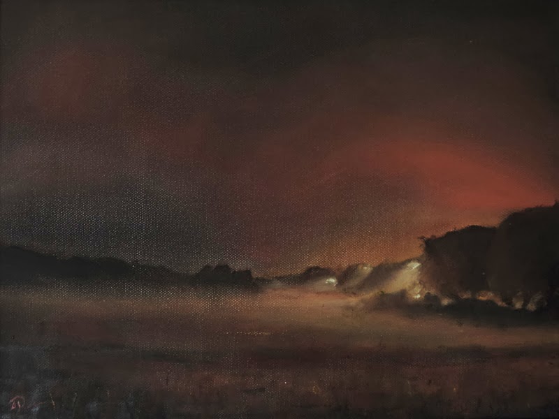
New Work: Nocturnes

Its time to call a temporary halt to my beautiful nightmare: considering the term nocturne's musical heritage perhaps I shall call it an interval.

I have loved making these, I think I could work on more for many months yet to come. They are strange - easy on the hands but incredibly difficult on the judgement. The hand and brush skills required are minimal but the everything else is demanding. When you are working within such a tiny tonal range then the way every mark catches the light, the sharpness or softness of every edge, the tiny differences in colour, the opacity and transparency of every glaze or impasto, the relative glossiness of each passage, the way the texture of the canvas is emphasised or disguised and a thousand other subtleties take on a disproportionate importance because they are the only way the space, the light and the looming quality of the landscape can be indicated. They are the hardest things I have done, and I am a better painter for having made them.

So far there are six. Two show the full moon in relation to the bushes that grow along the riverbank here, the square one barely shows the Thames itself reflecting back the inky sky. All of these three are dominated by the street lamps of either the M25 or Englefield Green which, although they are out of sight, are close enough to stain the sky near the horizon as if with a permanent, artificial sunset. The other three explore the impact of car headlights. In one they are blinding, in another they slash the world in half but at the same time help give form to it and in the third they are less dominant and give glimpses of the surrounding trees.

There are two larger ones yet to be started related to these, and three more which are just a gleam in my eye at this stage which will look at the way mist rises across the meadow. I'll freshen up with something else a little more autumnal before I make those though.


I know you must be sick of me bemoaning the difference between a painting and a photograph of that painting, especially given my tendency to build paintings from multiple layers of transparent paint, but never has it been truer than here. The plan is to show them in Guildford in January; coming and seeing them is the only way to understand the subtlety. I may put close-ups up here at some point to give you a chance, but I've gone on enough for one day!

Friday, 30 August 2013

That went quite well...

Officially my exhibition is now over and overall I'm quite pleased, especially with some of the contacts I've made. If you wanted to visit don't fret though - the unsold work will be remaining with the gallery for the foreseeable future and will be available from both the Chertsey and the Bramley branches. The prices are very reasonable! The gallery also sells online if you can't get there. I'd never recommend buying a painting without seeing it in the flesh because monitors will never be accurate enough with the colours but there is no issue with the monochrome linocuts they have so check out the No Naked Walls website - the link at the top of the page here will be staying there for as long as they have my work.

www.nonakedwalls.co.uk

Wednesday, 17 July 2013

New Work: Quercus Quercus

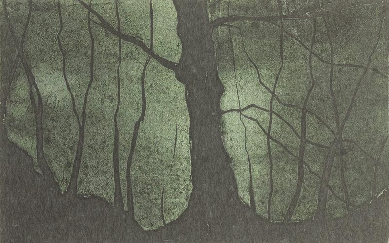
By now, any regulars here will know Cooper's Hill and the woods that blanket it. You've seen photos, paintings and linocuts. There's a path that runs along the bottom edge of the woods from the Ferrari garage past Mudward to the wizened tree in the April linocut before bursting out of the end of the woods and continuing on to the Runnymede Memorial. Partway along the path, if you care to look over your left shoulder, you will see two magnificent oak trees interweaving without ever touching. This linocut is a study of their winter silhouette.


It is an edition of 30 on Japanese-style washi. The printed area is about 13.5cm wide x 16cm high. I've varied pressure to leave the branches more lightly printed and the core of the trees darker and stronger.

As I'm prone to doing, I have taken a slight liberty with the title. Strictly speaking the trees are called quercus robur, commonly known as the English, French or Pedunculate Oak. If, however, one goes another level up through the taxonomy of plants, it is in the quercus section of the quercus genus (that basically means its in the white oak group of oak trees - you learn something every week here!) so although no-one would really call it quercus quercus if you stretch a point it kind of is. I wanted to call it that though because, just as two identical words come together to form one name, so two very similar trees come together to form one silhouette - indeed in summer they look like one tree with two trunks.

This is just step one on the path to something I find very exciting based on two observations - 1: it is so difficult to work out which branch belongs to which tree I might as well choose for myself and 2: one tree appears more masculine, the other more feminine. This is the final stage of my prep work except I need to change medium, find a different printing technique or work far bigger - any time I tried to shave the branches finer the lino started to crumble.

Thursday, 4 July 2013

Save the Dates: No Naked Walls & the Runnymede Gallery

Well, there's no backing out now for either me or the gallery!

Some of my work will be on show from 25 July to 29 August in Chertsey and some more during the first weekend of August, the 3rd and 4th, at the gallery in the National Trust Lodge at the Windsor end of Runnymede.

Since Chertsey is in effect my professional debut, the next two or three weeks are your last opportunity to buy from me at negotiable prices - thereafter my studio prices will be consistent with what I fetched at the gallery because to do otherwise would be unfair on the dealer and any collectors - so have a look at my website and if anything catches your eye contact me to find out about availability and pricing, you might be pleasantly surprised. I'm happy to ship worldwide but remember, when the show starts the prices will become more fixed!

Sunday, 23 June 2013

New work: Runnymede Skylines, Runnymede Skies part 2

Here we have the second batch. Again they are all oil on 24"x24" box canvas.


Reading from top left they show the hedges and houses which line the Egham Bypass on a bright, cloudy day, the hill above the mead in persistent, gentle rain, the Runnymede on Thames hotel at dusk with London, the M25 and Heathrow sort of making a second sunset in the background and finally the Runnymede memorial itself at night. I racked my brain for so long working out how to treat the memorial. Mentally, it is the most important landmark on the mead; it is the only building dedicated to the Magna Carta. Physically however, it isn't much more than an umbrella so there was a real difficulty making it prominent in the landscape without cheating or straining the scheme; the fact that it is floodlit at night gave me a way to show it while staying honest. The fact that the burning colours of the lights could be made to match the afterglow of the sunset and can feed the imagination is a bonus.

I don't have much more to add at the moment, I've said a fair bit about the series both on the blog and my website. It has occurred to me that this is such a flexible format that, given how the mead is constantly changing from hour to hour and week to week, the series could go on forever. There are still types of weather missing, along with the the warehouse, the pleasure grounds, the restaurant, the river and so on. I might re-visit it in the autumn when the change gets dramatic again but for now I have enough other things to keep me busy.

Friday, 14 June 2013

Paul Nash: Three in the Night

The photo in my last post of the trees by the river after dark reminded me to show you a drawing by Paul Nash of three trees by moonlight. He drew these trees on more than one occasion so I have also put up a daylight version. He was an artist who saw the mystery and magic of the landscape and it comes through strongly in these pictures.


Ever since I spent a night doing prep work for the Runnymede memorial painting I'll be showing you shortly, I have been badgering away trying to work out my response to how the landscape in general and trees in particular change at night. This is Nash's.

I know exactly how I want my work to look but I haven't yet uncovered a medium which ticks every box. I've considered drawing and printing and photography and different types of painting and even papercraft and none of them tick every box. Frankly, its driving me up the wall! There is a very different sort of physicality, almost an anti-physicality, that I want the work to have. Nash's drawing reveals the other-worldliness of trees at night but in itself is worldly. I want the work itself to belong in the same, altered place as the trees. I want the infinitely deep colours of paint, the precision of drawing, the slick textureless-ness of photography and the "what the hell's that?" quality of printing or of subtle tricks made of paper.

When the moon is fuller and the skies are clear I'll spend another night on the mead and a night at Ankerwycke as that should be fascinating in the dark. That will give me enough raw material, but it still doesn't solve the more fundamental problem.

I think photography is the front-runner at the moment. There are concerns. The fundamental one is that deep down I view photos as informing my painting instead of being an end in their own right. Perhaps what I need to do is go through the process of drawing and painting and then go back out to take photographs informed by the paintings. I have a lot of thinking and doing to work through, but I am excited by what I'm holding in my head; I will find a way to let it out.

Sunday, 2 June 2013

Adventures in Linocut: Cooper's Hill Coppice

Ta-daa! The first two linocuts. They show the woods above Runnymede. Each is an edition of 12 with one artist's proof which I will be retaining. Each is 10cm x 15 cm and printed with a raw umber oil based ink on handmade mulberry tissue. They will be for sale either mounted or framed; I will decide on final pricing when I have seen them properly presented.

The one to the left is the first I did. It shows part of the bluebell glade in May and is a good illustration of the consequences of the particular combination of printing technique and paper I have chosen. The paper is very variable in thickness, texture and opacity and has the odd small inclusion (a little leaf or petal) and they were printed with an improvised baren (that is to say I placed the paper on the lino then applied pressure manually, one section at a time) so I have been able to vary the pressure in different areas. This gave me the opportunity to react to the particular sheet of paper in relation to the design and, by fitting the paper to the lino before I started ( thicker areas of paper over the the darkest areas of the trees, thinner parts where I wanted relative softness and so on) and then varying the pressure I applied. I have managed to get some areas very harsh and others softer, some very dark and others faded to try and enhance the effect of light dappling to the ground. I felt it important to point this out because it means that there are substantial variations between each print; although they share a design each of the 12 is effectively unique.

The one to the right shows a tree on the edge of the woods in April before it had been swamped in leaves. It is far harsher, bleaker and more wind-swept, just like this April was! I have used the same techniques to play with the tones but restricted the variation to the bottom right corner and the bulkiest parts of the tree trunks.

Provide the framing is done these will make their debut at the art society's Spring show next Sunday at the Italian Concept restaurant in Egham from 10-ish am onwards.

Friday, 24 May 2013

Adventures in Linocut continued...

Here it is, a snap of my first linocut. It's one of the bluebell glades in the woods above the mead. When I've done a few more I'll be wishing it were better, but for now I'm chuffed. I've printed half the edition now and will do the rest tomorrow. Only having done the odd proof up until now I am surprised at just how physically demanding printing with a baren is - it may be easier with a proper one which is designed for applying pressure but I can't justify that expense yet so am improvising.


It's 10 x 15cm and in Raw Umber on mulberry tissue. I'm talking to a framer and if I can afford it, black walnut should set the ink off nicely. I'll take a proper photo when I've finished printing.

Monday, 20 May 2013

New Work: Virginia Water


Two simple paintings which show how my language has evolved in recent months. They both show the ornamental woods at Virginia Water on the cusp between late summer and early autumn.

The one on the left I started last year when I was re-learning to paint and I gave it up in frustration because it was so heavy handed. I have had to resort to cheap tricks to get it up to an acceptable standard but the point is my capabilities have come on enough that I could turn it round. There are a couple of issues I couldn't resolve without fundamentally changing the nature of the painting so I left them; after all I saw the picture as a missed opportunity rather than something fundamentally ill-conceived. It is important to me because it was where my ongoing fascination with the interplay between transparent and opaque paint first came to light. Beyond this, my interests had not yet become clear.

The picture on the right is a response to it and uses the same techniques and almost the same palette. Those of you who have visited my website will realise it is not the first time I have made a variation on this composition. It takes the transparent/opaque games and pushes them far farther. In doing so it reveals a problem I have come across before: it is very difficult to photograph work which depends on this relationship. All opaque paint and the camera picks up colour relationships fine. All glazes and, again, fine. But half and half means I can have either one set of colours accurate or the other but not both and not their relationship. Its a frustration and I will find a cure, I just haven't yet. Other than opacity, the 2nd painting draws on my experiments with space. Beyond that there is nothing especially sophisticated; on the one hand being too complex would prevent the paintings from working together and on the other, as I have said before, its nice once in a while to simply bask in the wonders that are before you rather than being clever for the sake of it. I take particular satisfaction that the second, new painting is so much more boldly, loosely and confidently painted yet it also displays a far defter and more delicate touch. With these two paintings before me, rather than flawed reproductions, it is clear I have come a very long way in a short space of time. I can't help but wonder where I'll end up.

Friday, 10 May 2013

Runnymede Skylines, Runnymede Skies Part 1

 Finally, after a few weeks of teasing them, here are the first three skyline/landmark paintings. There will be six in due course, maybe even more, but I am taking a week or two away from painting to freshen up before hitting those hard.

Collectively these paintings are intended to address the scale of Runnymede and the fickleness of spring weather here. Most of them take a wide view of the place - one of the ones I haven't started yet will actually contain a 180º field of view. In all of them, the landmark building is dwarfed by the mead which is in turn dwarfed by the sky. This first one, showing the Founder's Building of the Royal Holloway University lurking on the horizon, takes the tightest crop. It shows one end of the building almost a mile away but still dominating the Staines end of the mead. I have given the building a character which is half animal by exaggerating its owl-like shape and half paternal - it dominates in a supervisory way, not a threatening way - and it becomes part of the landscape as there is no boundary visible between the building and the line of trees on the horizon and because the trees and falling light by turns echo and reflect its shape. Both the hedge bounding the mead and the landscape have been reduced to simple cloud-like bands of layered transparent colour. The sky reflects this as we almost stare into the sun; it is a gentle, warm haze which may or may not be lightly clouded and it gives the painting a calm, almost feminine feel.


This painting is perhaps my favourite of the three although it has proved to be a bit of a git to photograph; it has lost a lot in translation from the painting - perhaps because the painting hangs so much on faint directional brush strokes and the interplay between opaque and transparent paint. It shows the Air Force memorial although this view doesn't exactly exist - I had to wear my x-ray spectacles to remove several trees. In the real world you can only really see the very top of the tower from this viewpoint. I love its dynamic feel and, again, the building is given animal qualities. It stands proud atop the hill with its back to the wind and wings spread wide. The wings of the building have missing edges and, combined with the treatment of two areas of trees at either end of the building, this makes them truly wing-like. There is an ambiguity about the building's relationship with the wind. Is it just standing there, joyfully feeling the wind on its back? Is it actually whipping the wind into a frenzy? Or is it exhorting the landscape to rise up and join it? In the flesh, the building belongs to the ground but dreams of the air as is appropriate for an airmen's memorial. In the painting, the colours mean it belongs to the sky and it appears to be trying to lift itself up, taking the hillside with it. Key to achieving this is the use of two different sets of not-quite-verticals in my rendition of the building.

The third of these paintings shows the two National Trust buildings at the Windsor end of the mead. The one on the left is a tearoom, the one on the right is the office and part-time art gallery.

This painting is late in the afternoon on a four-seasons-in-one-day sort of day - pretty standard April weather in Southern England. The two lodges are hunkered down below the tree-line at the edge of the mead, taking what shelter they can from the wind whilst basking in a sudden burst of sun. They are reduced to a beautiful combination of warm browns and I am delighted with their economy. You'll need to click on the picture to see the bigger version to appreciate it. I may post a close up later.

This painting shows the colours which I am using to tie the series together most clearly - the sky is pthalo blue and zinc white, the clouds are based on an indigo made from pthalo blue and vermillion which is largely scrubbed away, contrasted with lemon yellow, indian yellow and raw umber with highlights in impasto flake white. These colours are the foundation and common link between all of the paintings.

I am really looking forwards to doing the next three!

Wednesday, 1 May 2013

Barrier paintings

Here we are then, two paintings which have me caught in a thousand minds. Many of my compositions feature a distinct "here" and a "there"; these paintings were designed expressly to clarify my area of interest - am I interested in a two adjacent spaces with two characters, or am I interested in the junction - be it boundary or barrier - between them?


On the left we have a very simple composition. The Air Force Memorial, simplified, stylised and almost made animal is blurred into a streaky sky as if taking off. Before it are two barriers, impenetrable brush and a thicket of young silver birch trees which may be a barrier or may be a gateway and adds to the vertical movement in the painting whilst also tying the top and bottom together as if they were pieces of string. Space is very compressed, existing only as three planes and the viewer has no way to step into the painting - of the here/there elements I have spoken about this painting only has a "there", the "here" is implicit and the actual space the viewer occupies. It is a simple, likeable painting.

On the right by contrast we have a looming, organic monster. This is a view along the inside of an oversized hedge which cuts across the mead. Its a very different barrier with a very different handling of space. The perspective of the shrubs creates a tight and difficult space while preventing access to it. The only "here" available for the viewer to occupy is a small patch of sunlight. The painting only hints at the existence of a "there"; the mead and the wooded hill above are glimpsed, out of reach and in blinding sunlight. Although it contains far more space than the first painting it uses it to almost create a claustrophobic feel while the other uses the absence of space to create movement and freedom.

The problem I have with the painting is the unpleasant nature of the hedge. It was intended because the painting would not fulfil its function so well if it was pleasant. Nevertheless, its part of my job to find beauty within the ugliness. To me, juxtaposing bright, clear greens with grey and muddy greens is just ugly. Here though, it is necessary. The greens need to range from the bright to the de-saturated to create space because the bright sunlight and deep shadows mean the transition from light to dark is busy re-creating the weather so isn't available for the creation of space. I'm also uneasy about the texture of the paint. Its texture is true to the scene (every shrub is covered in thin moss) and the change in texture again builds space, but to me its far from attractive. The other painting then inherits a watered down version of these issues as they are intended to work together as a meditation on barriers and boundaries, space and the absence of space, here and there. This then is my simple problem. The paintings do what I want them to, but I don't like them.

Friday, 26 April 2013

Almost there


As you can see I've been back to the woods. This time I was sketching a couple of trees which, somewhere down the line, will make an awesome series of drawings/prints/paintings or maybe all three. They are two grand old oaks, each with a distinct feel. One is larger, the other slightly shorter and more gnarled and they appear to be of similar age. Their trunks are not 10 feet apart so all the way up their branches intertwine without ever touching and together they take on the classic silhouette of one oak. They look like an old married couple and the complexity of their relationship and the doubling-back of branches puts me in the bizarre position of being able to choose which branch belongs to which tree. Indeed that is what I was doing yesterday - working which branch belongs to which tree in reality and mapping out what happens to each main branch when it is out of sight. The plan is that by careful choice of branch ownership, use of colour and control of quality of mark (a softening here, a harshening there) the trees could speak of dancing, flirting, fighting whilst retaining the exact same silhouette across three pictures. It is only an idea, some manipulated photos and some diagrams at the moment as I do not want to get distracted from my current task of painting elements of the Runnymede skyline. The first two paintings are developing better than I hoped and today I start the third.

As to the woods, spring is now in full swing. Some species have proper leaves now, the ferns are unfurling fast and in some parts of the wood there are now big patches of bluebells. We are only a few days from the first sections being at their best while others haven't even got started yet. As the weather continues to heat up (it hit 27º in the boat yesterday afternoon) the Thames is starting its annual process of seducing me - although you probably gathered that from my post on Saturday.

Thursday, 18 April 2013

Spring: another progress report

As you may have gathered from my last post, I've got out and about over the last couple of days.

The paintings I'm working on incorporate a foundation made up of several layers of transparent paint and, working in oils, that means I can only put in a couple of hours a day. Hopefully that will change by Sunday when I'll start going in with opaque paint and a little wet-in-wet, and by then the last of the barrier paintings I mentioned before will have been finished so I can get a third one from my new series going. In fact, I think the last barrier painting is only about thirty seconds of work away from being done, but since it is in an area where the bare primer shows through I want to sleep on the decision and be sure as it will be irreversible. Correcting a mistake there would involve losing the sparseness and therefore fundamentally changing the balance of the painting. Since its a very complex painting - a view from inside a hedge - I really don't want to have to rework it for the sake of one rushed decision. I worked out that probably about 80% of my painting time is spent without even having a brush in my hand. I stand or sit there, nursing an empty cup of coffee, just looking and thinking. That ensures sections stay spontaneous and don't become over worked when I do paint them yet they also have sufficient consideration behind them. I do very much view a painting as the fossil of a thought process. So, waiting for paint to dry and with the next two compositions properly prepared and a third one just about there (I only have space to work on three paintings at a time), I have time on my hands. I don't want to approach another gallery right now as my best pieces have been bagsied so I can't spend time sending emails. I'm teaching myself linocutting as I mentioned earlier in the week but I don't want to spend all day carving. I can't gather material for the set of work after the set I'm working now as the trees aren't yet in leaf. I can't afford a train fare and the weather is too squally for cycling to London to be fun, so I've been walking and walking and walking.

Windsor Castle from the Thames path.

I followed the river up to Eton; I can't say how unchanged Canaletto's viewpoint is due to Private Property signs. The main buildings are the same but the gaps have been filled in. I discovered there has been a reshuffle amongst Eton's galleries which is good to know. Unfortunately the one I thought most likely to be helpful to me has gone, but a new one has opened up - although it could be the same one in a different building and with a different name. It is a gorgeous walk and some new views have been opened up which raise simple possibilities, but I will have to let them stew for a while - doing them as is would be cynical rather than professional.

Start bottom left and work clockwise: All the stages of leaf
development on one plant.
I also spent a few hours wandering the woods above Runnymede, seeing how spring in general and the bluebells in particular are getting on. The plants have finally got the idea! From a distance the woods have a new hint of green and everywhere everything is bursting. The bluebells' leaves are looking just about there now - no sign of the flowers but they won't be long. If you've never been to an English bluebell wood when they are in bloom you should put it on your bucket list - do it sooner rather than later though as we have been invaded by Spanish bluebells and the two species interbreed. In doing so, they lose their scent and the scent of a glade of bluebells is the stuff of legend.

Finally I headed up to the Air Force Memorial. Those of you who came here in the first few weeks of the blog will have read about it before. Quite apart from its purpose, it is an astounding space to move through. It is the first time I've been there in strong sun. I didn't realise the reason why the architect had made it point in that precise direction instead of a degree or two either way. Coming off from the main cloister are two curved arms that have a similar shape to wings. All the names on the walls of these wings are carved into window recesses. The sunlight rakes through tall thin windows and across the names, picking out the carving. The curve ensures that as the sun moves round another set of names is lit up.

It is just beautiful.

Thursday, 11 April 2013

Woo hoo revisited!

That was a productive morning!

I have just come back from a meeting with the No Naked Walls gallery in Chertsey and I am in a very good mood. I have had some useful feedback, an insight into what sells locally, a starting point for my pricing that is realistic locally, a confidence boost and an agreement. There is plenty of time for things to go belly up (I don't think they will, I just don't want to jinx it) but it looks like I will be part of one of their shows over the summer - a couple of particular pieces and then we'll review what else I have available nearer the time.

I'll post dates and more information when everything is firmed up but for now, woo hoo indeed! I think that calls for a cider or two.

Now, where's next?

Tuesday, 9 April 2013

From the archives: Celebrity Furniture

I've got a bit hacked off lately with trying to find particular versions of particular images on my computer; I use photography and Photoshop extensively as a supplement to my sketchbook but its all got a bit chaotic, so here I am, lounging on my bed in the dark with my headphones on, listening to music and having a tidy up. I have stumbled upon a cache of stuff I'd forgotten about, art work from before when I experimented with 3d modelling and CGI (this was back in the 90's but some of it stands up surprisingly well), an old web site I ran and best of all the stuff I did when I taught myself Photoshop.

Some of it is just simple colour correction, sharpening and retouching, but some of it isn't. I used to have a whale of a time making composite images, which was great because I learned a lot. I couldn't see the links between images on a screen, but give me a pile of catalogues, books and magazines and I could easily spot the rhythms, related perspectives, quality of light and analogous shapes necessary to pull this work off. I would find a couple of sources, scan them, then get masking, layering, airbrushing and generally making them fit together. I particularly enjoyed doing a series I called Celebrity Furniture where I would make a hybrid between, you guessed it, a piece of furniture or electrical appliance and a celebrity of the day. They made me laugh so I considered sticking them online but the internet wasn't then what it is now.

Ladies & Gentlemen, I give you the great and the good circa 1999 as you have never seen them before:

Patrick Stewart models a wall clock from the 1999 Argos catalogue
The beautiful Gail Porter wears a screen from a book of Art Nouveau furniture

Keanu Reeves and the unknown fireplace
  
New for 1999 from Hoover: The Stephen Baldwin
I lost interest and Mr Baldwin is only half done as a result, although they all betray my then beginner-level skills. Other subjects were the Kylie Minogue armchair, The Queen Elizabeth II table lamp and the Buzz Lightyear dresser:


Wednesday, 3 April 2013

Reproductions for sale

While I work out what I'm doing with regards to galleries, I have decided to sell reproductions of my work.

I will make use of the Saatchi Online website for this. Saatchi Online is a massive resource - maybe even too big - owned by Charles Saatchi and letting artists and collectors come together. It is un-juried so the quality of art on display is very variable and ranges from the dreadful to the exquisite. All prints are made on archival quality paper or canvas and can be shipped worldwide.

I am uploading one picture every now and then and it should be up to date by the middle of the month. I can't go any faster as I have to make sure the photographs are perfectly sharp from corner to corner for the high resolution printing, so some need re-shooting. It should be worth it though - you should be able to see every mark and every stroke although, as you and I both know, there is no substitute for the real thing. Speaking of which, if you would prefer the real thing, get in touch!

My work can be found at www.saatchionline.com/alanperriman although at the moment there are only some of the Origins sketches up there - I'll add all the work from my website in chronological order and I'll let you know when its up to date.